Yep, I haven't been to the National Portrait Gallery trip in London. I really wanted to, but I had some financial problems that time so I couldn't go, but I have used my time effectively, doing a test photoshooting in the studio, for the digital image production unit. I have detailed this in a separate post on my photography blog.
I hope I'll have another chance to visit London and the National Portrait Gallery in the future.
joi, 15 octombrie 2015

miercuri, 14 octombrie 2015
Creating a white base - Seminar - Week 3
Today we worked as a team to create a white base: Lia Lazar was the make-up artist, Ross Kershaw was the model and I was the assistant.
As an assistant I had to prepare the face for make-up application (remove any existent make-up, tone and moisturize the face), to write down everything, from products to brush used by the make-up artist, to make sure that every brush is cleaned in time to be used again and also to note how every new product looked on the skin.
Because we have worked in a team I didn't pay much attention at taking photos... and I forgot. But Lia took photos of everything (so I'll use the same photos as her for this blog post).
- The first product we have tried was the Illamasqua Skin Base Foundation in SB01 (which I don't have because I had problems ordering te Illamasqua kit - our university kit didn't show on their website anymore and it says that "there are no products matching this sellection"). We used this product on the bare skin (just with mouisturizer on) and I think that it has a buildable covering, from light to medium, but it doesn't make the face like "deep white". It looks better applied with the flat foundation brush - the first brush we tried was the stippling brush and it didn't work well.

- The second product we have used was the Kryolan Aqua Colour in White over the Illamasqua Skin Base Foundation. At first, we've put too much water on the brush but when we saw the unsatisfactory result we've adjusted the quantity of water needed. Even if we have done this, the result was still unpleasant, there were patches of skin showing and the coverage wasn't so good, everything looked cakey, even if the white was deeper in comparison to the Illamasqua Skin Base itself. We have used the flat foundation brush.

- The third product used was Kryolan Supracolour in white, applied with the flat foundation brush on the bare skin and then blended with the kabuki brush. This was the best product used so far to create a white base - it didn't dry so quickly and we could work at it until we were satisfied, and then blend and set with loose powder. It also provided a good, buildable coverage: light - medium and full coverage too, depending on how much we blend it. After we have set the Supracolour with translucent powder, the white was more intense. I love how easy is to work with this product in comparison with the products tested before.
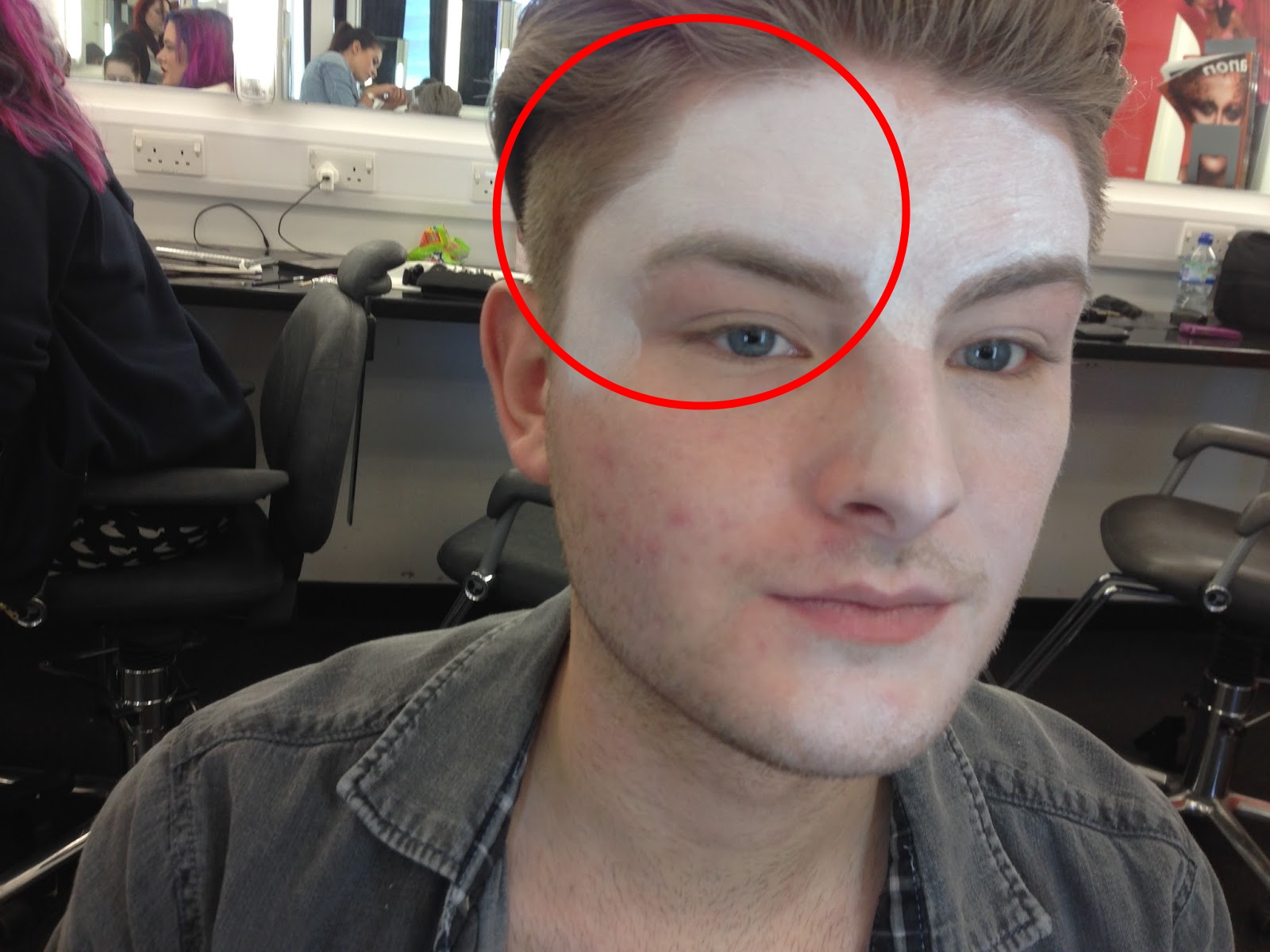
- The fourth product wasn't really a fourth product, but more a fourth experiment. We have applied the Kryolan Supracolour on the Illamasqua Skinbase Foundation. The difference was pretty big (and not in a good way), and we have concluded that the best way to achieve a white base is by using Supracolour on the bare skin.

Today I have learnt so many new things, as I have never worked with grease colors on the bare skin. Now I know how should I work with them in order to achieve a good result. Also, I always wanted to work with a male model and this was a new opportunity for me, as I practiced how to remove make-up from a face that has a beard.
Shaping and contouring - Studio - Week 3
Today we were taught by Sue about face shapes and how to highlight and contour the face with powder products. We had to work two on a model because the number of the people was uneven and we were the last three left without a pair. So I have worked on the other half of the face.
These are the steps that had to be completed to achieve this countouring:
- Cleanse, tone and moisturize the face;
- Apply (Kryolan) foundation that suits the model's skin tone and type and blend with a kabuki brush;
- Conceal (with Kryolan concealer palette and a concealer brush) where is necessary - unde the eyes, spots, blemishes, any redness- and blend (with a kabuki brush);
- Powder the face, especially the T zone (using Ben Nye translucent powder and a puff/powder brush);
- Highlight the upper cheekbones, the nazal bridge, the forehead (if necessary) and the arcade (with Kryolan highlighter and a small fluffy brush);
- Apply the shadow to sculpt the nose, the cheekbones, the edges of the forehead and underneath the mandible (Kryolan bronzer and contouring/angled brush);
- Add some blusher and we're done (Kryolan Blusher Palette and Real Techniques blusher brush)!

After we have finished the contouring I still had some time left and I decided to use it creatively - I wanted to test my new MAC eyeshadow palette and Lia was the greatest model ever for this. Here is the final look:


I really enjoyed today, especially the last part when I got some time to do Lia's eye make-up, as I haven't done make-up since I have moved away from home.
sâmbătă, 10 octombrie 2015
Analogous, Complementary & Monochromatic face charts design
Analogous:
Complementary:

Monochromatic:

Complementary:

Yellow and purple
Monochromatic:

Yellow (and white, which is a non-colour)
miercuri, 7 octombrie 2015
Colour theory - Seminar - Week 2
For me, today was the first time when I designed a make-up look on a facechart. At first, I didn't know how should I start. Should I use compact eyeshadows, aqua or supracolours? These were some of the questions that popped into my head at the beginning. Then I looked at what others were doing and I decided to use supracolours instead of eyeshadows. I didn't know that, when using grease colours, I should apply the base all over the face and then start working over and adding layers, but after that Kat told me that this is the proper way of working with these kind of products on facecharts. Using grease colors on a facechart really intensifies the colors and makes everything bold and if I want that effect I should definitely go for this kind of products.
I didn't know what to design, but, as I was applying the skin color, the ideas came into my head really easy and this is the final result:

At home I wrote down everything that I have used do create this look so I won't forget how I made it, in case I want to create this look in the future.
I have learnt that if I want to create harmonious make-up designs, I should be careful when choosing and mixing the colours. A colour wheel is essential in the process of developing a new design because putting colors together in a proper way is crucial if I want to create something beautiful.
That's how a colour wheel looks like:

At the seminar I have also learnt that colours can be clasified in:
- Monochromatic - using variations of the same color can create a striking palette, but it's difficult to use color effectively without adding black, white and shades of gray for contrast. I should select colors with a broad range of tints and shades to provide enough contrast;
- Analogous - selecting colors that are touching in the wheel creates a narrow, harmonious color scheme. Similar to monochromatic colors, analogous colors provide a predominantly warm or cool feeling, depending on where they lie on the wheel;
- Complementary - colors from the opposite ends of the wheel provide the most contrast. If I can stave off the temptation to add more colors, I have to limit them to only two to create a powerful look. But I have to arrange them wisely so they don't clash.
References for this post:
- The Colour wheel (2012) Available at: http://www.poeticmind.co.uk/research/the-colour-wheel/ (Accessed: 2015).
The perfect base - Studio - Week 2
The first step to a beautiful make-up is to create a flawless base. We have to imagine that our model's face is the canvas and we are the painters that add colour on it. You can't create a masterpiece if you don't give enough attention in creating the perfect canvas.
Today's studio lesson was all about creating the base properly.
Here are the steps to a perfect base, that will look good on camera (phography/HD filming):

Today's studio lesson was all about creating the base properly.
Here are the steps to a perfect base, that will look good on camera (phography/HD filming):
- First things first: remove any existent make-up, tone the face and then moisturize it;
- Apply a face primer (Illamasqua) according to the finish that we want or to the skin type;
- Apply foundation (Kryolan) with the foundation brush;
- Buff the foundation with a kabuki brush;
- Correct any blemishes, spots, dark circles etc with the (Kryolan) concealer palette and then blend;
- Apply (Ben Nye) translucent loose powder to set everything in place, focusing on the T zone (where most people have sebum excess).

duminică, 4 octombrie 2015
Inspirational images of contemporary and historical Elizabethan make-up
Historical Elizabethan make-up/portraits:

Queen Elizabeth I with a Fan, c.1585. Attr. to John Bettes the Younger. © National Portrait Gallery, London.

Tudor Make-up & Cosmetics - The Elizabethan era Queen Elizabeth I set the fashions and as she grew older she more wore elaborate make-up which was useful for hiding wrinkles and other signs of ageing. Queen Elizabeth had contracted small pox which had left some slight scarring on her face. As she grew older the heavy white make-up which she favored helped to hide this and maintain her illusion of beauty and image as the 'Virgin Queen'.

Unknown Lady, aged 21. Artist unknown. 1595-1600. The quantity and richness of the lady's jewellery indicates high status.

Portrait of Jennet Parkinson, wife of Cuthbert Hesketh of Whitehill, Lancashire. By George Gower, 1580. The Weiss Gallery, London.

Attributed to Sir William Segar Portrait of a Lady. Guesstimating c. 1585-90.

Lettice Knollys


Dorothy, Lady Dormer by Marcus Gheeraerts the Younger, c. 1596 (detail)
Contemporary Elizabethan inspired make-up:

Virginia Kiss in “Misty Dream” by Joanna Kustra for Factice Magazine

Modern interpretation of 16th century fashion.

Karen Elson as Elizabeth I - Face Forward by Kevyn Aucoin, 2000


References:
- Pinterest (no date) Available at: https://ro.pinterest.com/isimonagabriela/elizabethan-make-up-and-hairstryle-insp/ (Accessed: 2015).
Abonați-vă la:
Postări (Atom)