vineri, 13 noiembrie 2015

Recreating my complementary design for a collaboration

My complementary face chart

Today I had to recreate the complementary design I have done for my colour theory homework and it was great! I had the opportunity to help a second year Fashion Journalism student, whose name is Andruta Nicoleta Mihai, to do her "behind the scenes" short video and it was aaaaamazing!

I am super exhausted but I still have the energy left to write a few words about today's work...

I wanted to create a graphic cat eye look, which had complementary colours, so the contrast will make the make-up pop. This look is not a wearable everyday look but a fashion, editorial make-up, which doesn't really suit every eye shape, because it needs a quite big arcade and a crease. But fortunately I had a beautiful, patient model and everything turned up well. To make the eye make-up even bolder, I added some glitter and I felt it looked better than without. 
The overall finish of the complexion was dewy and tanned, because the lemon-yellow that I choosed made me think about warm, summer days, and I think that this worked best. In the end, I have up using purple in the upper corner of the nasal bridge and on the chin, because I felt like it was too much when applied on the model. On the facechart looks good, but I didn't like how it would look on the model. I've chosen to keep the eyebrows nice and clean, making them as I would usually do them for a beauty make-up, because the model's eyebrows were pretty thick and I just couldn't style them the way I wanted.
All in all, my design was about strong complementary colours, emphasized contouring, dewy and tanned skin and of course, graphic cat eyes!
I am excited about the result and I can't wait to see more of the video that Andruta made!


miercuri, 11 noiembrie 2015

Second practice of my design


This time I loved the result. Taylor definitely improved her skills and did the make-up way better than the first time. We tried to achieve a scmoother but not so smooth white base on the other side of the face and it worked better than on th first side that we've tried so we did only one side of the face, the good one. I am really pleased by how this turned up and I feel that Taylor gained more confidence and that's really good.

Historical Elizabethan make-up application - Studio

Last week, my partner Taylor, had practiced the historical Elizabethan make-up, and today it was my turn. 
I started by creating a consultation sheet and by consulting my model:


After this step, I started the cleansing, toning and moisturizing process.
After the face was properly prepared, I started my historical Elizabethan make-up application:
  1. Applied the Illamasqua skin base foundation in white with a kabuki brush and blended it out a bit (because for the traditional make-up we were told that we should achieve more like a "flaky and chalky" base, because Elizabethans haven't hot proper ustensils and products like we do, to achieve a smooth and even base);
  2. Blocked out the eyebrows with white Kryolan Supracolor and a mascara wand;
  3. Heavy powdered the face with a puff and Ben Nye neutral setting powder;
  4. Applied Kryolan blush from the blusher palette on the apples of the cheeks, in a dabbing motion (I asked my model to smile for me) with a blusher brush from Real Techniques;
  5. Applied White Supracolour on the upper and lower eyelashes using a disposable mascara wand, in a zig zag motion;
  6. Applied colour on the lips using my fingers, as a traditional Elizabethan would do.


Photos of my final result:


I am pretty pleased with my outcome and I really enjoyed applying the Elizabethan make-up in a traditional way.

marți, 10 noiembrie 2015

Taylor's first practice of my design

Today was the first time when me and Taylor met outside of the timetable to practice my design.
We worked a lot and stayed in the studio until it was closed... we worked from 4.30 to 8.30 to manage somehow to make it right. After this practice session I felt a bit sad because I thought that I gave Taylor a design that just cannot be done in 1 h 30, as we need for the assessment, but then she told me that she'll practice more at home and she won't give up so I trusted her. She didn't do a make-up course before neither did make-up on many people so she could be used to it, and I could see that it was a bit hard for her now, because she is at the beginning. But I tried my best to give her the best explanations possible, and in the end it went well. We also haven't got enough time to finish the whole look, as I've practiced hers first, and mine really needed a bit more time, but we tried the base and the eye make-up, along with the blusher. I didn't test more times at home, just a few days before, once, but for me it worked and I did it good from the first time, and I didn't realize that for somebody else would take more time to do it. Also, I don't really know if my indications were so good and I think I'll have to go through them one more time, so everything will be better next time. I'm seriously considering simplifying the design to take less time.
Anyway I see that Taylor really wants to improve her skills and to help me achieve the best outcome from my design and I believe that she will do this with more practice!


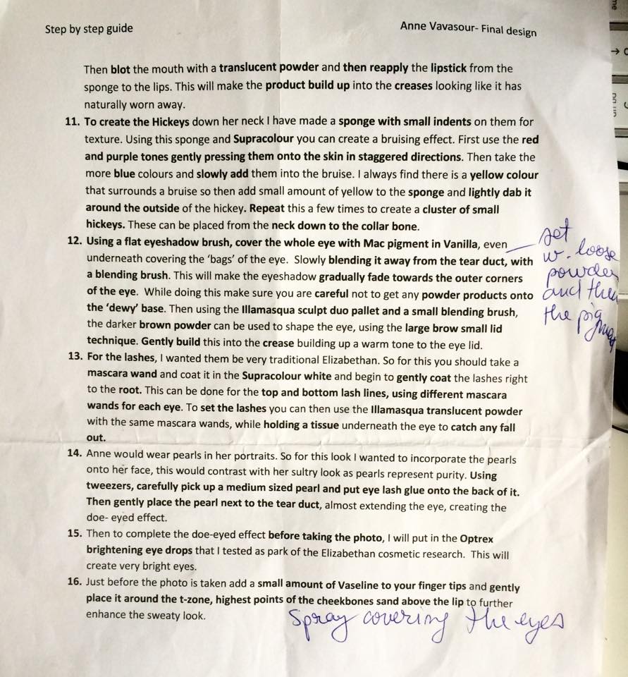
My indications:


First practice of Taylor's design

Today was my first attempt in creating Taylor's design of Anne Vavasour. It was a really hard day because we had to stay late in the studio to practice but after this practice session I feel  more confident about the assessment that is going to come.
At first I really didn't know how to start although Taylor was well prepared and bought me her facecharts and two sheets of printed indications. Maybe it was because I wasn't used with the products as I couldn't order my Illamasqua kit and she had some extra products added for her design.
But it got better after she explained literally every step that I had to do.
I am pleased by how my design turned up although I didn't really like the contour that much because I felt that I made it a little bit too harsh. I could work next time at reducing the time too, because this time it took me really long to finish the make-up. We forgot a few steps as well, but it wasn't a major change in the design. We'll try those steps next time when we'll practice.
I had a lot of fun doing the hickeys as I didn't do these before! It was really interesting to learn how to do them and what tools and products should I use. I feel like I know more things about make-up from today's practice session and that's a really good thing!


This is Taylor's final face chart, which I had to recreate:


Here are the indications for her design, which were annotated by me with the new changes and everything:


And here are the pictures from my first practice session:


luni, 9 noiembrie 2015

Example of my final look done by me at home

The facechart:


When I first tried to create my design on me, I didn't include the eyeliner strokes in the eye make-up because this idea came up during the process when Taylor did it on me.
I tried to achieve the whitest white possible just using Supracolour but it didn't work, so in my mind came the idea to use facepaint on the Supracolor. It worked, and to set everything and to achieve a deeper white, I've used baby powder. This was for the base. For making the eyebrows dissapear, I tried to block them with latex and tissue, but I realised that I don't really know how to do this properly and when I blended the eyeshadow it didn't look good so I left the other eyebrow simple, covering it with a feather. Everything else went well, but I noticed that in order to create fine blusher, not a harsh one, I needed to put more powder on so it can be blended better. I hope that when I'll first practice this with Taylor to work better.

 This was my initial example of the final look:


duminică, 1 noiembrie 2015

Development of my Lady in Waiting make-up design - Lettice Knollys

I have chosen the bad girl: Lettice Knollys (1540 - 1634)

Lettice Knollys as Countess of Leicester, c. 1585 by George Gower

For me this Lady in Waiting seemed to be the most interesting one, with the naughtiest story behind, and that inspired me. I thought that I can be more creative when doing a bad character so here I am, researching the historical background, the symbolism behind what I want to incorporate in my final design and creating another story for my character.
When I read a bit about Lettice, I instantly knew what I was going to do. Of course, my design changed a bit from facechart to facechart and from practice to practice, but it was the same idea from the start. I don't know why, when I'm super excited I can't sleep at night and when I'm in bed  I think a lot about what is going to happen, and then wonderful ideas suddenly pop into my head and I have to get out of the bed, turn on the lights and write them down so I can finally go to sleep peacefully and stop annoyng my boyfriend who tries to sleep. :))


Here are some interesting historical facts about Lettice Knollys:


  • Lettice Knollys was known as the Lady in Waiting that married Robert Dudley, Queen’s favourite;
  • She was the Queen’s cousin and they have been friends since childhood, being younger than her;
  • She was also one of the most beautiful women from the court, her features matching the 16th century standard of beauty;
  • Lettice had 3 husbands, and Robert Dudley was the second. After his death, she became a rich widow, beautiful but heartless;
  • Once the Queen heard about their “secret” marriage, she banished Lettice from the court.

Really interesting character, isn't it? Yep, for me it really is.

Mark Satchwill: Lettice Knollys


The struggle:

To create a contemporary design for Lettice’s look, I had to brainstorm a little… and I started by writing down what I have learnt researching.
And to write in my notebook every idea that came into my mind at night when I was trying to fall asleep.


My brainstorming sheet


My nasty notes and handwriting


After researching the secret meaning of every colour I wanted to use for my design, looking at portraits of Lettice Knollys and trying to imagine how her character was, I concluded the following:
  • I should use green for the eyes, because she was like a “green eyed monster”, envying Queen Elizabeth for everything she couldn’t have;
  • A touch of golden-green glittery powder in the centre of the eyes, because she got rich when she married her second husband, Robert Dudley, but again… considering the saying “The eyes are the mirror of the soul”, the green glitter also symbolised that her soul was corrupted and poisoned by envy, even if the sparkle (her beautiful features) tried to hide this;
  • Red for defining the inner corner of the eyebrows because red and green are complementary colours, which symbolises her duality (the friend and the “frenemy” for Elizabeth), and the contrast between her appearance and her soul’
  • Blushed cheeks symbolising youth and beauty (she was younger than the Queen);
  • Red and black ombre lips – she was sensual, beautiful, rich, but she cannot hide forever the poison that was inside her soul.

My first face chart.


Second face chart and the dirty blended one.


Third face chart and the best one.


References:

  • Elizabethan makeup 101 (no date) Available at: http://www.elizabethancostume.net/makeup.html (Accessed: 2015).
  • Lettice Knollys (2015) in Wikipedia. Available at: https://en.wikipedia.org/wiki/Lettice_Knollys (Accessed: 2015).
  • Lettice Knollys by Mark Satchwill (2007) Available at: http://www.artwanted.com/imageview.cfm?ID=553166&IRV=1 (Accessed: 2015).
  • Meaning of colors (no date) Available at: http://www.elizabethan-era.org.uk/meaning-colors.htm (Accessed: 2015).
  • Morton, J. (no date) Explore colors. Available at: http://www.colormatters.com/color-symbolism/the-meanings-of-colors (Accessed: 2015).